Join for FREE | Take the Tour Lost Password?
[x]

deviantART

 
©2004-2010 ~wredwrat
:iconwredwrat:

Artist's Comments

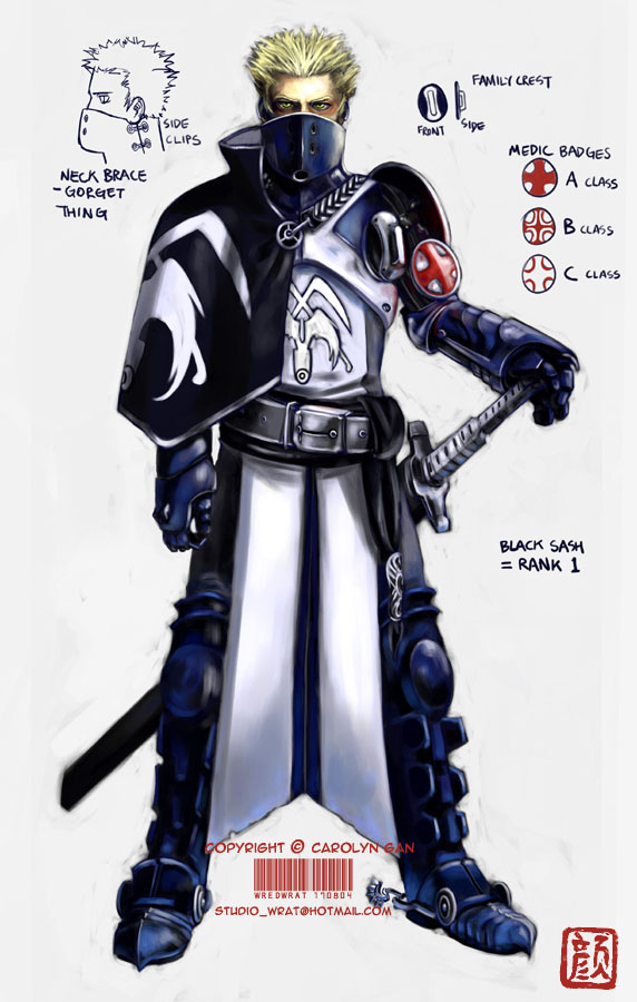
EDIT: I've fixed up his right (our left) arm; made it a little longer, and altered the medic badge system a bit. Thanks for your help and critiques everyone! ^__^

Lazy me actually decided to crank out a proper colour job this time. I'm happy with how Marius the knight here turned out. ^__^ He's one of the good guys, I haven't started designing the baddies yet.

I had heaps of fun designing the armour and the insignia. I love knights, I love armour, and I love uniforms! :love:
His armour was influenced by the uniforms of the French Imperial Guard; the footsoldiers have these cool blue jackets that have white X shaped lapels.

Marius © me.

Comments


love 0 0 joy 2 2 wow 4 4 mad 0 0 sad 0 0 fear 0 0 neutral 0 0
:icondeadlyn:
SICK!!!! :D + FAV! Love the name too. Thats fuking excelent! good job! :D

--
Never ask questions you know the answer to
:iconkeyarey:
Very nice! The design is simply awesome. It's very elaborate and well thought out! ^^ The high collar that covers the lower portion of his face gives Marius a type of, "Maybe I'm the good guy... maybe I'm not" kinda vibe, and the color choices are very nice, depicting that there's a difference between tools of war and righteous do-gooders. ^^. That's what I interpreted, anyway ^^;

Great job! ^^

--
*~ll Hope and fear of death are things belonging only do those who have a desire to live... wanna play some Russian Roullette? XD. ll~*
:icondestructo-:
too bad the french never won a war! Anyway... love your stuff and covet your fame... give me some of those favs! I just need to make the front page once.... the first time has got to be the hardest.

--
----------------
Memorial Trees -
Treemember - Plant a Tree
:iconsakki-chan:
Oh wow the shading and design are incredible! This is really really well done. Congrats :clap:
:iconjustplainjoe:
Excellent work as always :)

My only constructive criticism is that his right arm is a bit too short. By lengthening the forearm, you'd have the proper sizing. Otherwise, lovely concept, and beautiful shading and details.
:iconanom:
Bleeding.... awesome.. O.O
:iconsora-ko:
Whoa, coolness! :D The design is awesome, I see why you like knights... ^^

--
"The IQ of a mob is the IQ of its most stupid member divided by the number of mobsters."

-- Terry Pratchett
:iconduneboo:
Okay, I love the idea for the Medical Badges - A, B, C classes are filled according to rank! Greak work at making it look all metalic and shiney! Theres really so much fantastic detail in here, I look over the whole piece and keep finding more each time. XD Hehe and I really like those little spurs on his boots, man, I definatly need to work on trying to making my metal stuff look oh so good. ;P
:iconwredwrat:
His arm actually has a bit of a bend under that cape, but the way it's turned out it sorta does look rather short. I've gotta do something like make his elbow stick out a bit more from beneath the cape or something.. hmm..
Thanks for pointing that bit out! ^__^ :w00t:

--
Step over the frame, live in the picture. ~T. Fogarty
:iconwredwrat:
Thank you, your interpretation is pretty much spot on! Woohoo!! I'm glad the design worked out! ^O^ :hug:

--
Step over the frame, live in the picture. ~T. Fogarty

Details

August 17, 2004
103 KB
572×900

Statistics

122
691 [who?]
32,536 (25 today)

Site Map